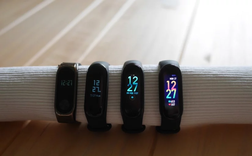
Xiaomi has recently released the new Mi Band 5. Since I have owned the each band starting with the Mi Band 2, I think it is time to look back and see where the Mi Band has gone in the recent years.
Table of Contents
- Screen legibility comparison
- Apps/ on band Screens
- Charging
- The Mi-Fit app
- Mi Band history
- Disclaimer
Actually, the Mi Band story started ahead of the Apple Watch in 2014 with the Mi Band 1, which was a pure fitness-tracking device without a display and even without a heart-beat sensor. This made the device not very appealing to me – even thought it already offered sleep monitoring.
It also already had that interchangeable wrist-bands that allow you to customize the look to your liking. The Mi Band 2 you see in the images uses a custom steel wrist-band as the original one broke after some years of usage.
Below you see a comparison of the Mi Bands, regarding the features that are most significant from my perspective
Mi Band 2
- Released 2016
- Clock
- Heartbeat
- Notifications
Mi Band 3
- Released 2018
- Clock
- Heartbeat
- Notifications
- Timer
- Weather
- Workouts
Mi Band 4
- Released 2019
- Clock
- Heartbeat
- Notifications
- Timer
- Weather
- Workouts
- Music control
Mi Band 5
- Released 2020
- Clock
- Heartbeat
- Notifications
- Timer
- Weather
- Workouts
- Music control
- Cam shutter
The first thing to note is probably that Xiaomi accelerated the release cycle from 2 years between the Bands 1, 2 and 3 to 1 year between Band 4 and 5. We will come back to this when talking about the Mi Band 5.
Screen legibility comparison
Lets start the comparison with the screen, which is the most obvious part and the one you will probably interact with the most.
Here, the most significant property is neither size nor resolution, but rather legibility in sunlight. For comparison, I set up a little benchmark as follows:
- set the Bands to maximal brightness (as applicable)
- legibility in direct sunlight on a bright sunny day as a worst-case
- legibility in shade/ with overcast condition as a more common scenario
You can find the results below. Also see the banner image for how the screens look indoors.
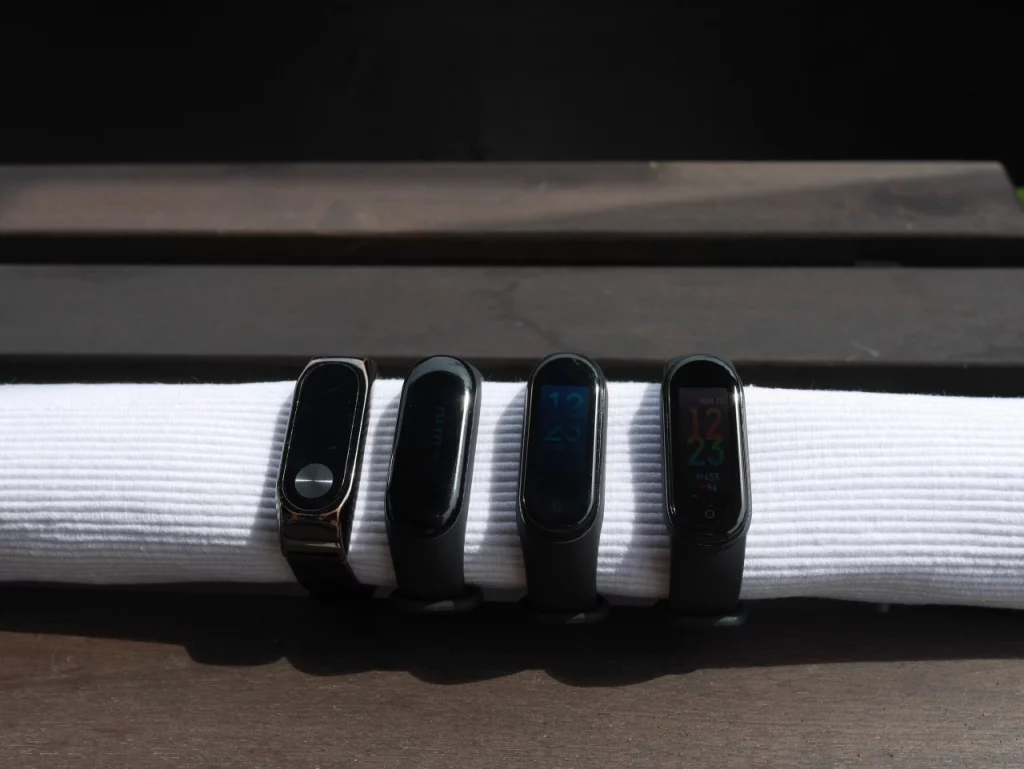
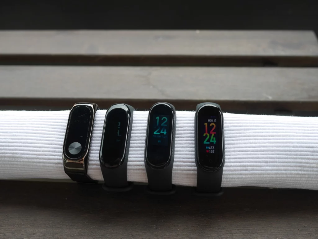
First I should note that the camera does not do justice to the Mi Band 2 & 3 as their displays are scanline-based and the fast shutter can not capture the whole screen being lit at once. Therefore you only see the top part of the Mi Band 2 and the right part of the Mi Band 3 on the overcast picture.
Nevertheless, one actually cannot read the Mi Band 2 in direct sunlight and only can barely read it in the shade. The other Bands are well readable in the shade. However, I would say that only the MiBand 5 is well readable in direct sunlight.
Next, we will look at how the information is presented. The screen size continuously increased from 0.78″ on the Mi Band 3 to 0.95″ on the Mi Band 4 (+22%) to 1.1″ on the Mi Band 5 (+16%).
As you can read the time on all of them, we will look at an app to find out whether it makes any difference in practice. Here, I picked the weather app as it is probably useful to the majority of the readers.
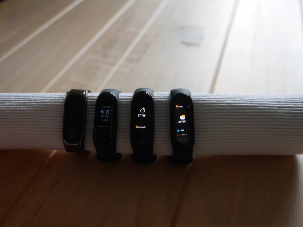
Looking at the Mi Band 4, it did not really take advantage of the larger screen-estate and shows virtually the same information as the Mi Band 3 – only adding the location info.
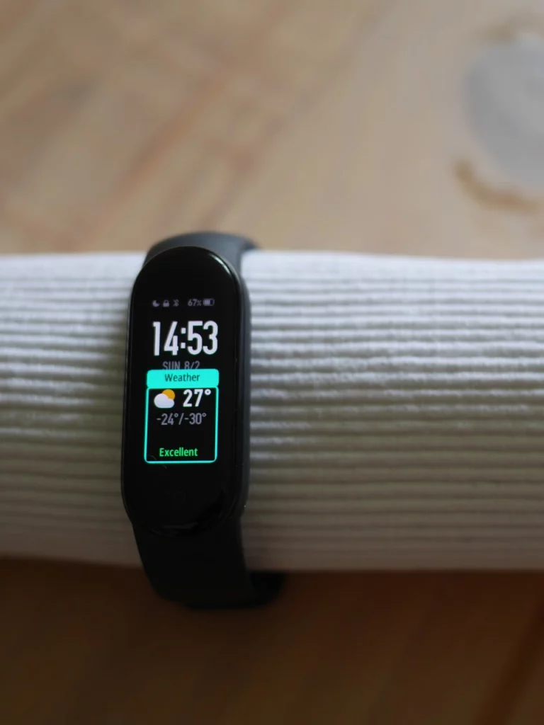
The Mi Band 5 on the other hand uses the extra space to show the rain probability. It generally displays more info like the wind strength and the current UV level – however you have scroll down for them.
The Mi Band 2 does not support weather and is thus turned off.
Apps/ on band Screens
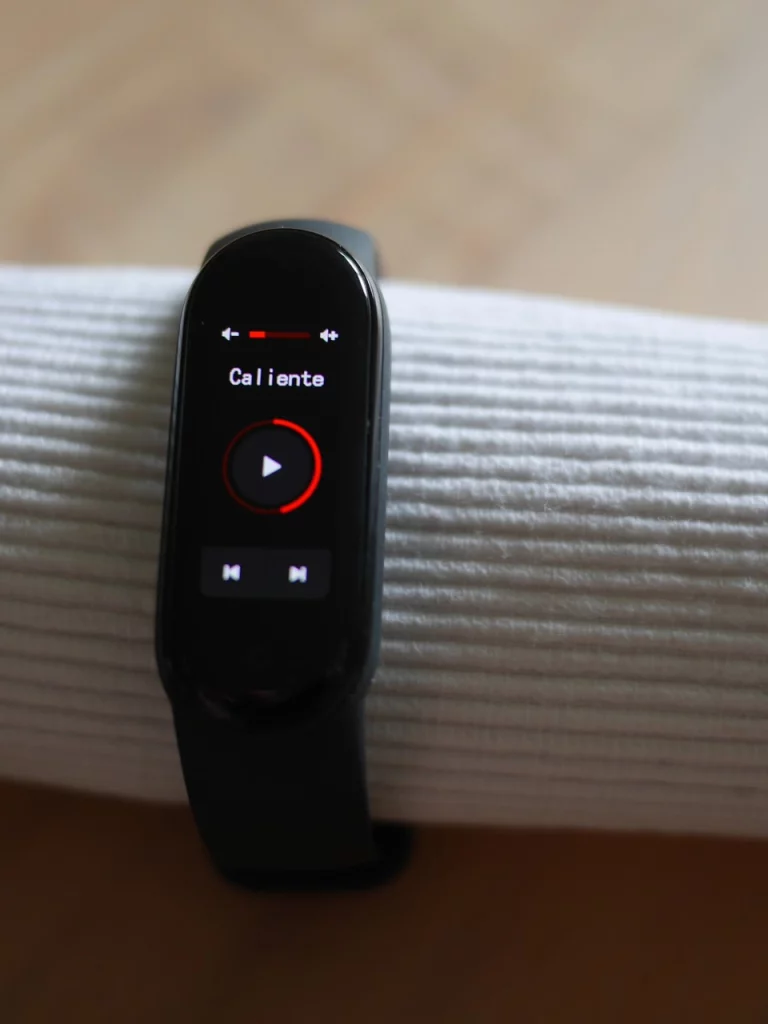
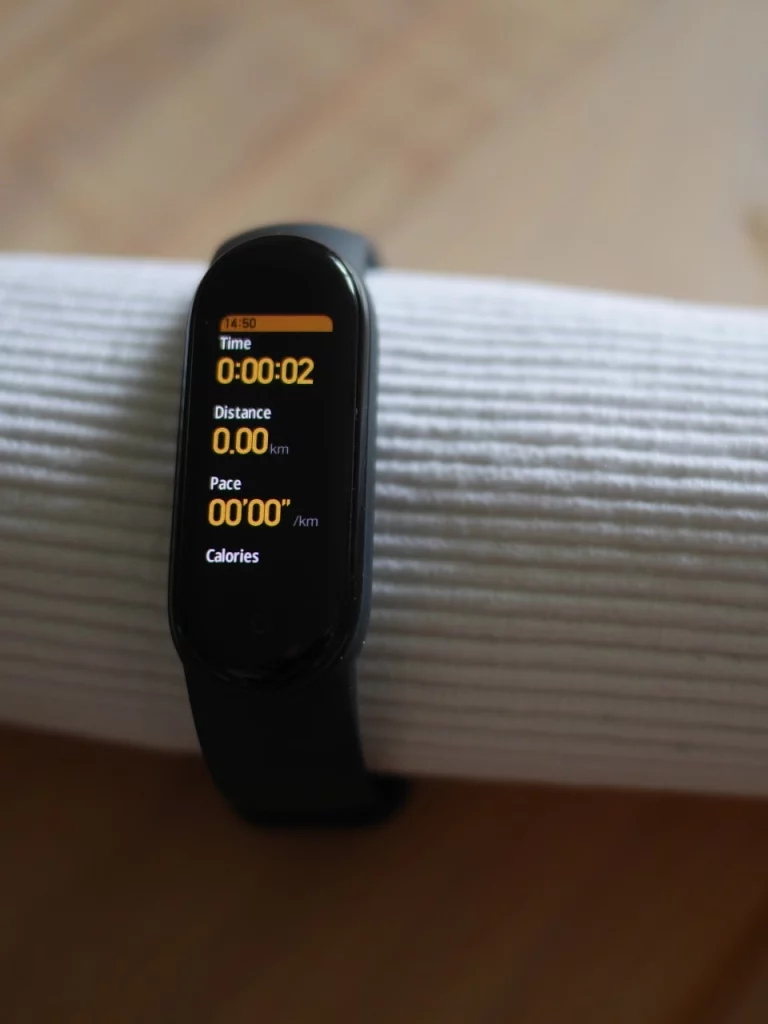
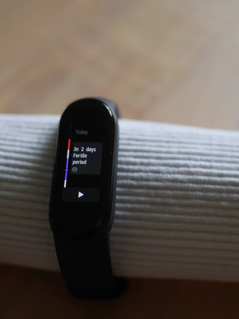
Lets also briefly look at the other apps. The images were captured on the Mi Band 5 – however unless otherwise stated the look exactly the same on the Mi Band 4.
Charging
The Mi Band 5 is the first band, with a magnetically attachable charger – hence you do not have to take the band out for charging. This convenience comes at the price of a reduced battery-life from about 20 days with the Mi Band 4 to only 14 days with the Mi Band 5.
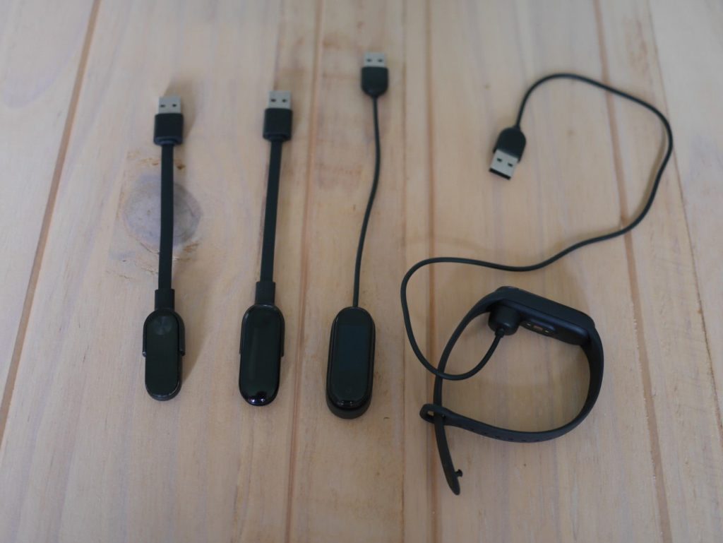
As for compatibility, you can charge the Mi Band 2 with the Mi Band 3 charger – the other way round is not possible as the Mi Band 3 is too large for the older charger.
Even though, the Mi Band 4 & 5 have their charging pins at the same location, the chargers are not compatible as the Mi Band 4 lacks the magnetic hold and the Mi Band 5 is too large for the old charger.
The Mi-Fit app
For the Mi Band the accompanying app is quite important as it is the only way to view your sleep data and to monitor your weekly/ monthly stats.
First, lets take a look how you can customize the different Bands from the app. Here, we should note that all bands are still supported by the app.
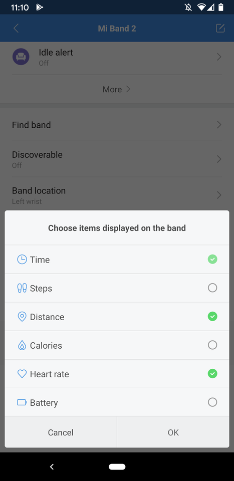
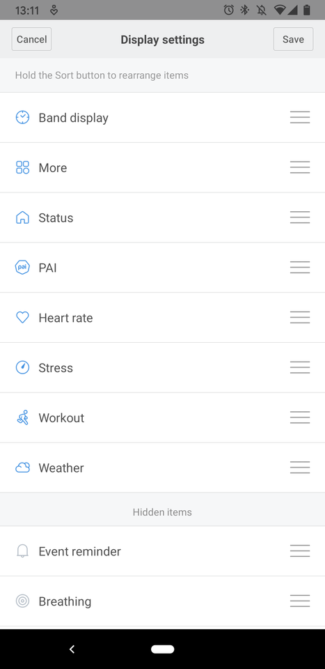
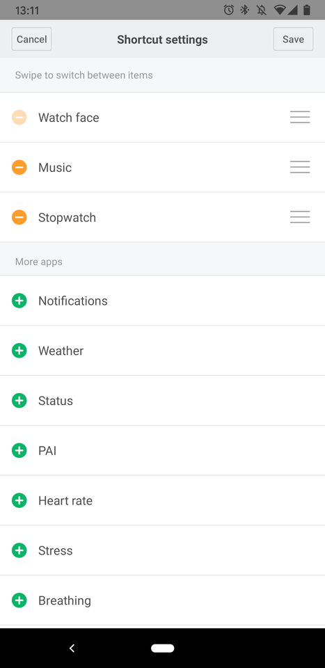
With the Mi Band, there is only a predefined set of screens/ apps out of which you can pick the ones you want. This is probably the largest difference to a real smart-watch, where you can install additional apps from a store.
With the Mi Band 2, the whole set fits on half a screen and you can only enable/ disable the items.
With the other Bands you can additionally re-order the items, which is quite useful as it allows to choose which item appears first when you swipe up or down on the home screen.
On the Mi Band 5, you can additionally configure which app appears when you swipe left/ and right. This is hard-coded to Music Control (and Ali Pay on the CN version) with the Mi Band 4.
So the basic things work. Lets look at some peculiarities of Mi Fit next.
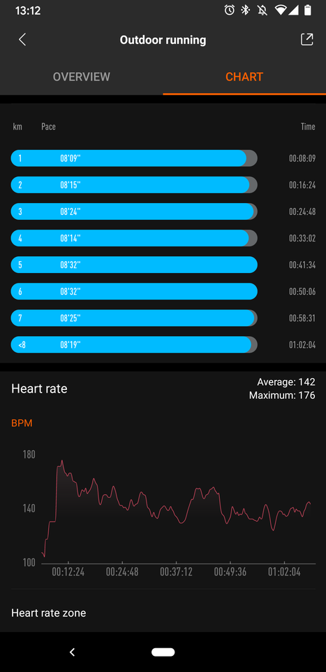
First you see the workout view for outdoor running, which displays some useful stats like your pace per km and the continuously measured heart-beat rate over time.
What you do not immediately see is that the app only counted ~7.3 km, while my running distance is actually 10 km, which I have verified on google-maps.
One might now think that this is due to imprecise measuring of the band – however on the activity overview, where the daily steps are counted, the running activity is correctly accounted as 10.1 km – which is impressively accurate, given that it only counted the steps.
So the error is only present in the workout app, which is still quite annoying as it also provides the live view during a run.
If someone from Xiaomi is reading this: the error factor of ~0.73 is suspiciously close to the km to miles conversion factor of 0.625.
The error is present with both the Mi Band 4 and Mi Band 5, so I guess it is actually in the App, where I already reported it several times.
If you want happy customers, you better fix this. Many other reviews actually blame this on the band!
Addendum: with the firmware update to v1.0.1.32, the band now measures ~9km which reduces the error factor to 0.9. We are getting there.
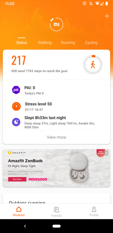
So having talked about the bad, lets continue with the ugly. The second screenshot shows you an in-app ad for some obscure Xiaomi product on the home-screen.
These do not show up too often and currently only advertise their own products. However, this is definitely the wrong path you are on.
Ultimately, this leaves me with mixed feelings about Mi Fit. In the Mi Band 2 days it started as a slim and functional app. However, at some point they decided to re-write it with the cards-look and animations. This rewrite moved core views one level down in the menu hierarchy and the added animations actually make the app feel sluggish.
Now, with each Band generation new features appear and are integrated in some sub-menu of the app.
For instance, you get weather-alerts nowadays. However, they are not controlled in the general Band notification settings, but rather in the weather menu.
Therefore, I doubt I would discover them as easily if I would not have watched the app grow.
The good news is that due to the popularity of the Mi Band, there are several alternative apps to try, which I probably will do next.
Mi Band history
In the following, I give a quick outline of how the Mi Band evolved. If you only came here for the Mi Band 5 review, skip forward to the Mi Band 4 section.
The Mi Band 2 was released 2016, about a year after the first Apple Watch launched, which brought the wearable category to the mainstream.
At a price of less then 20€ the Mi Band offered most interesting wearable features to me, like heart-beat measurement, sleep monitoring, forwarding of smartphone notifications and ultimately, simply being a wristwatch.
Also it was an ideal way to try this new wearable thing without spending 350€, that Apple called out.
To my surprise the step-based distance estimation was already accurate back then – except for the actual workout mode, that is – as explained in the Mi Fit section.
Mi Band 3
The larger and brighter screen is the obvious advance of the Mi Band 3. However, the significant part is that it also became a touch-screen – whereas the Mi Band 2 only had the single touch-button. This allowed you swiping forth and back of the screens instead of just cycling through them and it also made virtual buttons possible. These are necessary for starting the stopwatch and timer, which are probably the most important additions for me with the Mi Band 3.
You could also start a selection workouts directly from the watch, instead of going though the app. However, this only included a treadmill mode, while I am interested in outdoor running – so I continued using the activity view for that.
More importantly, it added the weather app. If find this to be surprisingly useful. As with the time – even though you find the same info on your phone – having it at hand is better.
Mi Band 4
Again, the colored screen is the most obvious advance. It does not improve usability in any way though. It displays the same data as the monochrome screen of the Mi Band 3, which is probably more power-efficient. It adds a lot of bling though and is brighter and thus better legible in sunlight.
Speaking of bling, you can install third-party watch-faces now and there is a heap of faces to chose from. Take a look here to get an impression.
Turning to something useful, the touch sensor was noticeably improved. With the Mi Band 3 your swipes were sometimes confused with taps, which does not happen with the Mi Band 4 anymore.
The workout app, now finally included outdoor running, which is still broken though (see Mi App section). This makes the music control app the most important addition for me. At least on android, it works with any music player and allows skipping forward/ back and adjusting volume.
This is quite useful when you play music from your phone at a party or for controlling your Bluetooth headphones.
One can use the same wrist-bands as for the Mi Band 3. This made upgrading for me back then a no-brainer, but is also a strong reason to choose the Mi Band v4 over v5, today.
Mi Band 5
This time, there are no obvious advances and the update is rather evolutionary. It does not mean it is insignificant though as it improves the usability on many levels. If you are new to the Mi Bands, you should pick this one.
The most important one is probably the new magnetic charger. Previously you had to take the “watch” out of the wrist-band to charge, whereas you can simply attach the magnetic charger now.
Next, the screen is slightly brighter which makes a difference in direct sunlight though (see screen comparison section) and also boasts more information.
Finally, the software was also noticeably improved. The band displays generally became more configurable. E.g. the custom left/ right swipes which now give you 4 quick access screens instead of 2. Then, the built-in watch-faces now allow customizing the additional info they display. And it continues with the small things like the configurable alerts in the workouts (although the workout app itself still needs to be fixed).
Also, the selection of predefined watch-faces is vastly better then with the Mi Band 4. On the latter you have a hard time finding a watch-face that is simple and does not feature some animated comic figure screaming at you.
These changes could be provided as an update to the Mi Band 4 as well, but are – at the time of writing – exclusive to the Mi Band 5.
Addendum: Mi Band 7
After a while I have upgraded to a Mi Band 7, but then switched to a Garmin Vivoactive 5, abandoning the Mi Band 7 due to its deteriorating battery. This change allowed me to compare both devices.
Using the accurate treadmill mode on the Mi Band 7 and GPS on the Vivoactive 5 for running, the Mi Band measured 9.96 km while the Vivoactive recorded 9.92 km, which is impressive given the Mi Band lacks GPS.
For heartbeat measurements, the Mi Band recorded an average of 128 BPM (146 max), while the Vivoactive measured an average of 129 BPM (147 max).
Despite sticking with the Vivoactive for its better user experience, the Mi Band offers impressive value.
Disclaimer
The Mi Band 5 was provided to me free of charge by banggood.com. So if you liked this review and want to support me consider buying using the following affiliate links:
